Yeast sample data
This example showcases how to load the yeast sample data, plot it and plot the location of the chromosomes.
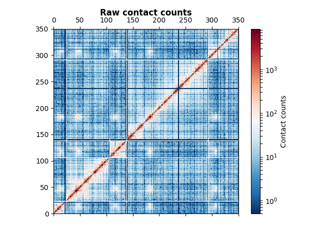
This data set corresponds to the first 5 chromosomes of the budding yeast S. cerevisiae, from Duan et al.
from iced import datasets
Start by loading the data. The data is composed of a counts ndarray matrix and a corresponding length vector. The size of each much match
counts, lengths = datasets.load_sample_yeast()
assert(counts.shape[0] == lengths.sum())
We are then going to plot the data. The contact counts are typically very enriched close to the diagonal. Thus, we use a Log normalization on the contact count data in order to see all the details of the plot. The data here is very noisy : it corresponds to raw data. We plot the chromosome boundaries in white and add a colorbar.
import matplotlib.pyplot as plt
from matplotlib import colors

fig, ax = plt.subplots()
# Add 0.5 to the contact count matrix to avoid taking the log of 0
m = ax.matshow(counts+0.5, cmap="RdBu_r", norm=colors.LogNorm(),
               origin="bottom",
               extent=(0, counts.shape[0], 0, counts.shape[0]))
chromosomes = ["I", "II", "III", "IV", "V", "VI"]

# Now plot the chromosomes boundaries and set the title
[ax.axhline(i, linewidth=1, color="#ffffff") for i in lengths.cumsum()]
[ax.axvline(i, linewidth=1, color="#ffffff") for i in lengths.cumsum()]
cb = fig.colorbar(m)
cb.set_label("Contact counts")
ax.set_title("Raw contact counts", fontweight="bold")
Total running time of the script: ( 0 minutes 0.263 seconds)